Choosing the perfect paint colors for your home interiors
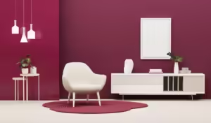
Choosing the perfect paint colors for your home interiors can significantly impact the atmosphere and functionality of each room. For living rooms, warm and inviting hues like soft greys, beige, or muted yellows create a cozy and welcoming space. Bedrooms benefit from calm, relaxing tones such as soft blues, greens, or neutral shades like light grey and blush pink, promoting restful sleep. In kitchens, fresh and energetic colors like crisp white or pastel green brighten the space, while deep reds or dark greens add elegance to dining rooms.
For home offices, soft greys or pale greens enhance focus, and in bathrooms, serene tones like aqua or soft pastels evoke a spa-like ambiance. Children’s rooms come alive with playful, bold colors, while light neutrals in hallways create an airy, open feel. By balancing paint choices with natural light and existing décor, you can create a harmonious and stylish home interior.
Understanding Color Psychology
Color plays a pivotal role in shaping our emotions and influencing our moods. This phenomenon, known as color psychology, asserts that the shades we choose for our home interiors can significantly alter the atmosphere of our living spaces. A well-informed selection of colors can transform a room, making it feel welcoming or tranquil, vibrant or energizing, depending on one’s intent and desired outcome.
For instance, shades of blue are often associated with calmness and serenity. This is why many people opt for varying tones of blue when designing bedrooms or areas intended for relaxation. Pale blues can evoke a sense of peace, while deeper hues can create a sophisticated and tranquil environment. Such effects can be particularly beneficial when incorporating mithila paints, which are celebrated for their serene imagery and soothing palettes.
On the other hand, yellow is commonly recognized for its invigorating nature. Bright yellows can stimulate feelings of happiness and positivity, making them an ideal choice for kitchens or playrooms where energy and creativity are encouraged. Similarly, warm reds and oranges can imbue a space with a sense of warmth and coziness, often suitable for social areas like living rooms. These colors serve to create an inviting atmosphere conducive to interaction.
Green, representing nature and balance, can offer a grounding effect, perfect for spaces designed for work or study. Such shades can be particularly effective when used in conjunction with intricate designs found in mithila paints, which often showcase nature-inspired patterns that further enhance the calming influences of green.
Ultimately, understanding color psychology can empower homeowners to make thoughtful decisions when selecting paint colors, allowing them to harness the emotional impact of color while enriching their interiors. By intentionally blending different shades and hues, an individual can create spaces that reflect personal style while also catering to the mood they wish to foster.
Assessing Your Space
When selecting paint colors for your home interiors, it is essential to assess the unique characteristics of your living space. Understanding factors such as natural light, room size, and existing decor will significantly influence your color choices. A well-lit room can often accommodate a broader spectrum of colors, while spaces with limited light may require more careful consideration to avoid feeling too dark or cramped.
Begin by evaluating the amount of natural light your space receives throughout the day. Observe how sunlight interacts with the room at different times; north-facing rooms tend to receive cool light, while south-facing ones receive warm light.
This distinction can impact how colors appear on the walls. For instance, mithila paints in warmer hues may look inviting and vibrant in sunlit spaces but could appear washed out in dimly lit areas. Thus, it is crucial to sample colors in various lighting conditions to see how they transform throughout the day.
Next, consider the size of your room. Lighter shades can help open up smaller spaces, making them feel more expansive, while darker colors can add a sense of intimacy. If you are working with a large room, opting for deeper tones can create a cozy atmosphere, especially if the room is not well-defined in terms of layout.
Additionally, the proportions of your space will guide your decisions, as high ceilings may benefit from bolder colors to draw the eye upward, while low ceilings might feel more suitable with lighter tones that create an airy feeling.
Lastly, take into account the existing decor and architectural elements in your home. Look for harmonious color palettes that complement your furnishings and accessories while considering any architectural styles. Mithila paints can be a beautiful choice to maintain unity in design, enhancing both traditional and contemporary interiors with their rich textures and patterns.
Popular Color Trends
In recent years, the world of interior design has seen an evolution in color preferences, reflecting broader lifestyle changes and aesthetic desires. One significant trend currently making waves is the use of earthy tones, which connect interior spaces to the natural world.Colors like terracotta, warm greens, and muted browns create a sense of warmth and comfort, as they resonate well with the ever-increasing emphasis on sustainability in home décor. These tones can be seamlessly paired with the vibrant patterns found in mithila paints, thereby enriching the aesthetic experience in living spaces.
Timeless classic colors such as shades of gray, navy blue, and soft whites remain favorites among designers. Gray, in particular, has emerged as an adaptable neutral that can work across various styles, from contemporary to rustic. It pairs beautifully with striking accent colors, enhancing the overall sophistication of a room. Navy blue offers a deep, calming presence while creating a luxurious feel, especially when combined with metallic accents.
Moreover, we are witnessing the rise of innovative palettes that challenge traditional norms. Bold hues like vibrant oranges and rich purples are being employed in more daring ways, often as feature walls or in statement furniture pieces. These colors can evoke feelings of joy and creativity, encouraging homeowners to express their individual style. Recent design showcases highlight the successful integration of mithila paints in such bold palettes, as they offer intricate designs that complement a range of color choices.
In conclusion, the spectrum of trending paint colors promises to cater to diverse preferences, whether one leans towards the calming influence of earthy tones, the elegance of timeless classics, or the adventurous nature of innovative shades. Embracing these trends can enhance the beauty and livability of a home, providing a canvas for self-expression and comfort.
Choosing the Right Finish
When it comes to selecting paint for your home, the finish is as crucial as the color itself. Different paint finishes offer unique characteristics that not only affect the overall appearance of the surface but also influence the functionality of the paint. Understanding the distinctions among various finishes is key to making an informed choice for each room.
Matte finishes are known for their non-reflective qualities, making them ideal for ceilings and walls in low-traffic areas. They provide a smooth and velvety appearance, which can enhance the aesthetic of rooms where warmth and coziness are desired. However, this type of finish may not be the best option for spaces that experience high wear, as they are more challenging to clean.
Eggshell finishes, on the other hand, serve as a versatile choice, striking a balance between matte and satin. They offer a slight sheen, making it easier to wipe clean while still delivering a refined look. This finish works well in living rooms and dining areas, where a touch of elegance is needed without excessive shine.
Satin finishes boast a softer glow than gloss, making them suitable for family rooms and bedrooms. They can withstand scrubbing, thus they are practical for walls that may encounter fingerprints and other marks. In kitchens and bathrooms, where moisture and humidity are common, semi-gloss paints become the preferred option. Their high sheen not only enhances durability but also adds an element of sophistication.
Gloss finishes are the most reflective, ideal for trim, moldings, or accents that require highlighting. While they are easier to clean and offer great durability, excessive use of gloss can overpower a space, making balance essential. In selecting the right finish for mithila paints, consider the specific use of the room, lifestyle demands, and desired visual effects to achieve the perfect combination of beauty and functionality.

Creating Color Schemes
Developing a cohesive color scheme for your home interiors can profoundly influence the ambiance and aesthetic appeal of your space. A well-planned color scheme allows you to express personal taste while ensuring harmony throughout your home. There are several techniques you can employ to create effective color schemes, including the use of complementary colors, monochromatic palettes, and accent colors. Here are step-by-step instructions to help you design the perfect paint palette.
Firstly, consider beginning with a color wheel. This tool is essential for identifying complementary colors, which are opposite each other on the wheel, such as blue and orange or red and green. Using this technique, you can achieve a vibrant, dynamic atmosphere. To apply this to your home, select one dominant color for larger spaces like walls, and then incorporate the complementary color through accessories, furniture, or artwork, creating visual interest without overwhelming the senses.
Alternatively, a monochromatic palette involves using varying shades of a single color. This approach offers a sophisticated and serene atmosphere. To create such a scheme, choose one base color, and then select lighter and darker shades of that hue. For instance, if you opt for a soft blue, consider pairing it with a light sky blue for the walls, while using navy for accents in decor items. This method maintains unity while allowing for intrigue through depth and contrast.
In addition to these primary approaches, you may wish to incorporate accent colors. Typically, an accent color is a bold hue that stands out and can draw attention to specific elements within a room. For example, if your primary color scheme is neutral, adding a striking yellow or vibrant teal through cushions or an artistic piece can enliven the overall feel of the space. By thoughtfully blending these strategies, you can create a harmonious environment that beautifully showcases mithila paints and enhances the aesthetic of your interiors.
Testing Paint Samples
When selecting the ideal colors for your home interiors, it is essential to thoroughly test paint samples before making a final commitment. This process not only helps in visualizing how the colors will appear in your space but also enables you to understand how different lighting conditions affect the hues. A color that seems vibrant in a store may appear dull or overwhelming once applied to your walls, highlighting the importance of this crucial step.
To conduct effective testing, start by acquiring samples of the paint you are considering, particularly brands known for their quality, such as mithila paints. These samples are often available in small containers, allowing you to experiment without a substantial investment. Once you have secured your samples, apply swatches on the walls of the rooms you intend to paint. Choose a section of the wall that receives ample natural light, as well as areas that may remain dimly lit.
It is recommended to apply at least two to three coats of the paint in the selected area. This will give you a better sense of the color’s true depth and vibrancy. Observing the swatches at different times of the day is crucial since natural light can drastically alter how a paint color looks. In the morning, the soft, warm hues of sunrise can bring out different undertones than the stark light of midday or the cool shadows of the evening. Be sure to step back and view the paint from various angles and distances, as well, to gauge how it interacts with your existing décor.
This careful observation will help you ensure that the chosen colors harmonize well with your furniture and lighting, resulting in a cohesive look. Utilizing this method allows you to make well-informed decisions, ultimately leading to a more satisfying outcome for your interior spaces.

Room-Specific Color Recommendations
When choosing paint colors for your home interiors, it is essential to consider the specific function and atmosphere of each room. Different colors can evoke varied emotions and responses, making it crucial to select hues that align with the intended purpose of the space. For instance, in living rooms, warm and inviting colors such as soft beiges, light grays, or muted earth tones create a cozy atmosphere conducive to relaxation and social gatherings. A subtle use of mithila paints can enhance the aesthetic appeal of these spaces, bringing a touch of cultural heritage into modern homes.
Bedrooms, being personal retreat spaces, typically benefit from soothing colors that promote rest and tranquility. Light blues, soft greens, and pastel shades can induce a sense of calm. These colors facilitate relaxation while offering a serene backdrop for restorative sleep. Incorporating mithila-themed artwork or decor in these hues could further reflect personal style while maintaining a peaceful ambiance.
In kitchens, brighter and more vibrant colors can energize the space and foster creativity. Shades of sunny yellows, soft oranges, or even crisp whites can invigorate the room, making it an excellent area for culinary exploration and family gatherings. The incorporation of mithila motifs in wall art or accents could contribute to a vibrant yet harmonious kitchen atmosphere.
Finally, bathrooms typically benefit from colors that evoke cleanliness and freshness. Soft whites, light blues, or even pastel greens can create a spa-like feel, essential for relaxation and rejuvenation. A judicious use of mithila designs in tiles or wall art can enhance the overall aesthetic, blending traditional elegance with modern sensibilities.
Choosing the right colors tailored to each room can substantially improve the overall look and feel of a home, highlighting the unique attributes of environments while utilizing diverse influences such as mithila paints.

Incorporating Accent Walls
The trend of incorporating accent walls into home interiors has gained popularity due to its ability to inject personality and depth into space. An accent wall provides an opportunity to showcase a particular color or design, setting it apart from the surrounding walls. When implementing this design element, selecting the right wall to accent is crucial. Typically, the best candidate for an accent wall is a wall that naturally draws attention, such as the wall behind a bed in a bedroom or a wall with a fireplace in a living room.
Choosing the right color is equally important. It is advisable to select a hue that complements the overall color palette of the room. For instance, if the surrounding walls are painted in soothing neutral shades, a vibrant and bold color can create a striking contrast. Mithila paints, known for their vivid colors and intricate designs, can serve as an excellent source of inspiration for this accent. Utilizing such paints can enhance the visual appeal and reinforce the unique character of the room.
An effective way to harmonize the accent wall with surrounding colors is to consider the furniture and decor in the room. Analyze the color of the furnishings and accessories, ensuring that they either match or beautifully contrast with the accent wall. If, for example, your furniture has earthy tones, a muted earthy tone for the accent wall may bring a sense of unity.
Similarly, metallic or glossy finishes on furniture can be complemented with a cheerful, glossy accent wall featuring Mithila patterns, creating an engaging focal point. Ultimately, the key to a successful accent wall lies in balance and cohesion, which can be achieved by careful selection of colors and designs that are both visually appealing and reflective of your personal style.
Final Touches and Decor Integration
Choosing the right paint color for your home interiors extends beyond just selecting a shade that appeals to you; it necessitates thoughtful integration with your existing decor. Leveraging the beauty of mithila paints, known for their vibrant hues and intricate designs, can elevate your interiors while maintaining harmony with your other furnishing elements. When contemplating your color scheme, consider the existing furniture, textiles, and artworks that occupy your space. This consideration ensures that the overall aesthetic remains cohesive.
Start by assessing the dominant colors present in your decor. For instance, if your furniture features rich wooden tones or pastel shades, select a paint color that complements these elements rather than competes with them. Mithila paints can serve as an excellent base, as their unique patterns and colors can enhance and reflect the textures of your textiles and the lines of your furniture. If you have bold artworks or statement furniture pieces, opt for neutral or muted wall colors that allow these items to stand out, creating a balanced interior.
Textiles play a significant role in the overall ambiance of a space. Fabrics such as curtains, cushions, and area rugs should harmonize with the paint color chosen. For example, if you decide to paint a room in a sunny yellow inspired by mithila paints, use complementary fabrics in shades of blue or green to create visual interest. Additionally, consider layering different textures within your textiles to enrich the decor while keeping within the same color palette.
Ultimately, the goal is to create an environment that effortlessly reflects your personal style while ensuring all elements work together harmoniously. By carefully selecting paint colors and acknowledging your existing decor, you can transform your living space into a beautifully cohesive home that embodies your unique aesthetic.