Introduction to Color Matching
Mithila Paints, originating from the Mithila region in Bihar, India, represent a vibrant and rich cultural heritage. This art form is characterized by intricate patterns, detailed motifs, and a lively palette, reflecting the traditions, stories, and daily lives of the local communities. The artists, predominantly women, use this expressive medium not only to beautify their surroundings but also to convey spiritual and social messages. Each painting serves as a narrative, making color an essential element of the storytelling process.
The creations are notable for their use of natural materials, which elevate their aesthetic value. Traditionally, artists utilize earth pigments derived from minerals, plants, and various organic sources to achieve vivid colors. These materials are often locally sourced, ensuring that the artworks remain interconnected with the cultural landscape. This reliance on natural resources not only embodies sustainability but also ensures that hues used in Mithila Paints are both striking and authentic.
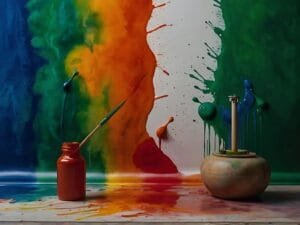
Color plays a pivotal role in Mithila Painting, as each hue carries specific meanings and implications. For instance, red often symbolizes fertility and power, while green is associated with nature and prosperity. The careful selection and matching of colors is crucial, as it can alter the perception and emotional impact of the artwork. An understanding of how colors harmonize or contrast with one another forms the foundation for successful color matching, which enhances the overall beauty and significance of the piece.
As one delves deeper into the world of Mithila Paints, it becomes evident that mastering color matching is integral. This understanding not only honors the tradition but also allows for contemporary adaptations and innovations in the art form, ensuring its relevance in the modern world. Through this guide, we will explore the techniques and principles that underpin color matching in Mithila Paints, providing artists and enthusiasts with valuable insights into this extraordinary craft.

Understanding Color Theory
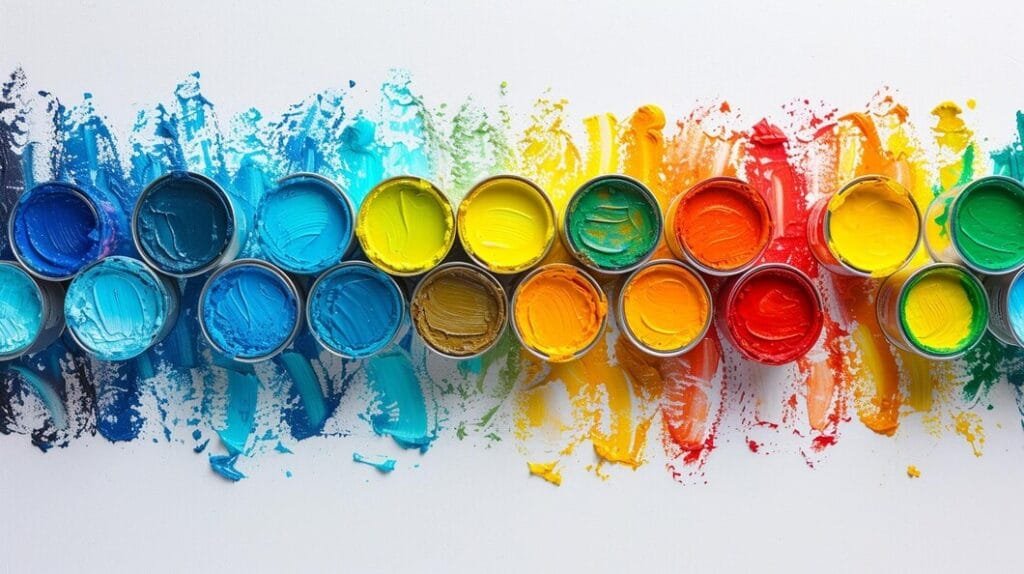
Color theory serves as the foundation for understanding how colors interact, harmonize, and can be effectively utilized in various artistic expressions. At its core lies the color wheel, a circular representation of colors that assists artists and designers in comprehending color relationships. The primary colors, red, blue, and yellow, form the basis of this wheel. These colors can be mixed to create secondary colors—green, orange, and purple—while combining secondary colors with primary colors results in tertiary colors such as red-orange or blue-green.
An essential part of color theory involves understanding complementary colors, which are located opposite each other on the color wheel. When paired together, these colors create striking contrast, enhancing the visual impact of a piece. For example, the pairing of blue and orange evokes a dynamic and energetic feel, thus making it a popular choice in various artistic mediums, including Mithila Paints. Conversely, analogous colors, which are adjacent to one another on the wheel, offer a more cohesive and serene aesthetic. An example of this would be the combination of blue, blue-green, and green, which creates a harmonious palette suitable for tranquil settings.
Color harmony is a vital consideration in achieving visual balance through color selection. Utilizing color theory principles helps artists and designers make informed choices when painting with Mithila Paints. Employing these theories allows for the creation of pieces that not only resonate with the intended emotion but also align with the aesthetic objectives. By understanding the dynamics of color interactions, one can manipulate hues, saturation, and contrast to create visually appealing artwork that embodies both tradition and innovation.
The Importance of Color Matching in Art
Color matching is a fundamental aspect of art that significantly influences an artwork’s emotional resonance and visual appeal. For artists, particularly those involved in the rich tradition of Mithila Paints, understanding the nuances of color coordination is crucial. The deliberate selection and combination of colors can enhance the narrative conveyed through the artwork, allowing artists to evoke specific feelings and atmospheres that resonate deeply with the audience.
In Mithila art, color selection is not arbitrary; each hue possesses symbolic meaning, contributing to the depth and context of the piece. The accuracy of color matching ensures that the intended message is communicated effectively. For example, the vibrant reds in Mithila paintings often signify love and passion, while greens might represent growth and harmony. By harmonizing these colors, artists achieve both aesthetic balance and meaningful expression. This careful orchestration of hues can transform a flat image into a dynamic story, inviting viewers to engage with the artwork on a more profound level.
Moreover, consistency in color matching is imperative for maintaining the integrity of a particular artistic style, including Mithila. Artists trained in this discipline often develop a keen eye for how colors interact, ensuring that their pieces reflect not only personal creativity but also the cultural traditions intrinsic to their heritage. Successful examples of color matching in Mithila creations can be observed in works where artisans employ a specific palette harmoniously throughout the entire composition, enhancing the visual flow and coherence. This attention to detail not only elevates the artistic quality but also preserves the cultural significance of the art form, allowing it to be appreciated across different contexts and by diverse audiences.

Techniques for Effective Color Matching
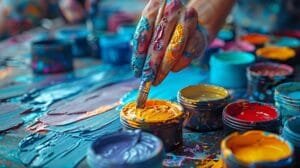
Color matching is a crucial skill in the world of Mithila paints, allowing artists to create harmonious and visually appealing works. This section will explore various techniques that can enhance one’s ability to match colors effectively. One of the most fundamental methods is color mixing, where artists combine primary colors to achieve a desired hue. Understanding the color wheel and the relationships between colors can greatly assist in this process. By experimenting with different proportions, artists can create an expansive palette that aligns with their artistic vision.
Another effective strategy involves testing color combinations on a small scale before committing to a larger project. Artists can create swatches or samples on scrap material, allowing them to visualize how colors interact with one another. This practice not only aids in color selection but also helps in identifying any potential clashes that could detract from the overall composition. Artists should take notes on their findings, as this record can serve as a valuable reference for future projects, fine-tuning their color matching abilities over time.
Furthermore, the integration of digital tools can enhance color matching techniques significantly. Software programs and mobile applications that offer color picking features enable artists to sample colors from photographs or digital images. This technology provides insight into color values, saturation, and contrast, facilitating a more precise color matching process. By leveraging these digital resources alongside traditional techniques, artists can expand their skillsets, ultimately improving their craftsmanship in Mithila paints.
Through consistent practice and experimentation with these techniques, artists can refine their approach to color matching, leading to a more sophisticated understanding of color theory and its practical applications in their work. Each technique, whether it be mixing, testing, or utilizing digital tools, plays a vital role in mastering the art of color matching in Mithila paintings.
Creating a Color Palette for Mithila Art
Developing a color palette for Mithila paints is an essential aspect of producing authentic and expressive artwork. This process involves a careful selection of colors that not only fulfill the visual requirements of the piece but also resonate with the thematic and cultural significance intrinsic to Mithila art. A well-thought-out palette can significantly enhance the visual storytelling, allowing artists to convey emotions and ideas effectively.
When creating a color palette, consider the theme of your artwork. Mithila art often embodies various themes ranging from nature and mythology to social commentary. For instance, if the piece focuses on nature, incorporating earthy tones like greens and browns, along with vibrant shades of flowers, can create a harmonious representation of the subject. Alternatively, for spiritual or mythological themes, utilizing bold colors such as deep reds, royal blues, and bright yellows can enhance the narrative, reflecting urgency and significance.
The mood is another critical factor when curating a cohesive color palette. Soft pastel colors tend to evoke feelings of serenity and calmness, suitable for tranquil subjects, while high-contrast colors may bring vibrancy and energy, suitable for dynamic narratives. Furthermore, the interplay of darker and lighter hues can create depth and dimension, drawing the viewer’s eye across the artwork.
It is also vital to respect the traditional color usage in Mithila art. The Mithila region is known for its rich cultural heritage, where colors often carry specific meanings. For instance, red signifies fertility and prosperity, while yellow represents peace and happiness. By integrating these traditional concepts into your color selection, you honor the cultural significance while expressing your unique artistic vision.
Ultimately, crafting a color palette for Mithila art requires a thoughtful approach to color choice, combining personal expression with respect for tradition. This balance will not only enhance the overall aesthetic of the artwork but also ensure that it resonates with its cultural roots.

Common Mistakes in Color Matching and How to Avoid Them
Color matching is a crucial element in the realm of art, particularly when working with Mithila paints. Despite its significance, many artists often encounter common pitfalls that can detract from the effectiveness of their artwork. One prevalent mistake is the over-reliance on bright, bold colors. While these colors can bring vibrancy, relying solely on them may lead to a lack of depth and interest. Instead, artists should focus on developing a well-balanced palette that incorporates both bright and muted shades. This approach enhances the visual dynamics and creates a more cohesive piece.
Another frequent error is the insufficient use of contrast. Effective color matching requires careful consideration of how colors interact with one another. A common misconception is that high-contrast color combinations are only suitable for particular styles or genres. In reality, incorporating varying levels of contrast can add dimension and interest to any artwork. Artists should explore contrasting colors strategically to make subjects stand out while also ensuring that the overall composition remains harmonious.
Furthermore, many artists overlook the importance of color harmony—a fundamental aspect of creating visually pleasing artwork. Failing to understand color relationships, such as complementary, analogous, or triadic schemes, can result in a disjointed appearance. To foster better color dynamics, it is beneficial to study the color wheel and apply these relationships thoughtfully. By being mindful of these common errors and their solutions, artists can refine their color matching techniques and create more compelling and aesthetically pleasing works of art.
Through the awareness of these typical pitfalls involving color matching in Mithila paints, artists can cultivate a deeper appreciation for the intricacies of color dynamics. This, in turn, leads to the enhancement of their work and the successful conveyance of their artistic vision.
Cultural References and Color Symbolism in Mithila Art
Mithila art, renowned for its intricate details and vibrant colors, is deeply rooted in the cultural heritage of the Mithila region of India. Each color utilized in this traditional painting style carries specific meanings, reflecting the community’s values, beliefs, and emotions. Understanding the symbolism behind these colors enhances one’s appreciation for the art form and informs the choice of hues in Mithila Paints.
For instance, red is often associated with fertility, power, and beauty, making it a prominent choice for depictions of marriage ceremonies and celebrations. It evokes strong emotions and is frequently used in the ceremonial art that adorns the walls during rites of passage. Conversely, yellow symbolizes knowledge, prosperity, and enlightenment. In Mithila paintings, it signifies the warmth of relationships and often appears in scenes that celebrate nature and the harvest.
Blue, a color that denotes the divine and is often linked to the Hindu god Krishna, invokes feelings of quality and often represents spiritual themes. This color is believed to inspire devotion and reverence, playing a vital role in paintings that narrate mythological stories. On the other hand, green is commonly associated with nature, growth, and renewal, representing the lush landscapes of the Mithila region. It is a hue that infuses vitality into the artwork and connects the art to the agricultural roots of the community.
Furthermore, the colors in Mithila art are not merely decorative; they carry educational value, conveying moral stories and societal norms. For example, black can represent both negative traits and the omnipresence of the divine, reflecting a duality that is essential in the community’s storytelling process. Each color choice is intentional, embodying deeper meanings that resonate with the viewer, ultimately enriching their understanding and connection to Mithila Paints.

Conclusion: Elevating Your Art with Thoughtful Color Matching
In the world of Mithila Paints, mastering the art of color matching is essential for creating visually compelling and impactful artwork. Throughout this guide, we have explored various techniques and principles that can significantly enhance your approach to color selection. By understanding the underlying intricacies of color harmony, contrast, and the emotional resonance different color combinations evoke, artists can elevate their creations to new heights.
It is important to recognize that color matching is not merely a technical skill; it is a deeply expressive aspect of art that allows creators to communicate their emotions and cultural narratives. Embracing the vibrant palette characteristic of Mithila art offers an opportunity to engage with not only aesthetic qualities but also the cultural heritage it represents. Therefore, as you embark on your artistic journey, do not hesitate to experiment with diverse colors, patterns, and techniques.
Additionally, be mindful of the historical context and symbolism inherent in Mithila designs, as this knowledge can significantly influence your color choices and contribute to the authenticity of your work. Utilizing the principles outlined in this guide—such as the relationship between colors and the stories they tell—will enable you to forge a deeper connection with your audience.
Ultimately, the fusion of thoughtful color matching and the soulful essence of Mithila artistry can yield extraordinary results. By applying these techniques and drawing inspiration from the rich cultural tapestry of Mithila, artists can not only enhance the visual impact of their work but also convey profound messages and narratives. Take the time to explore, create, and let your artistic expression flourish through intentional color choices, thus celebrating the true essence of Mithila Paints.
